Black + Decker Packaging Guidelines
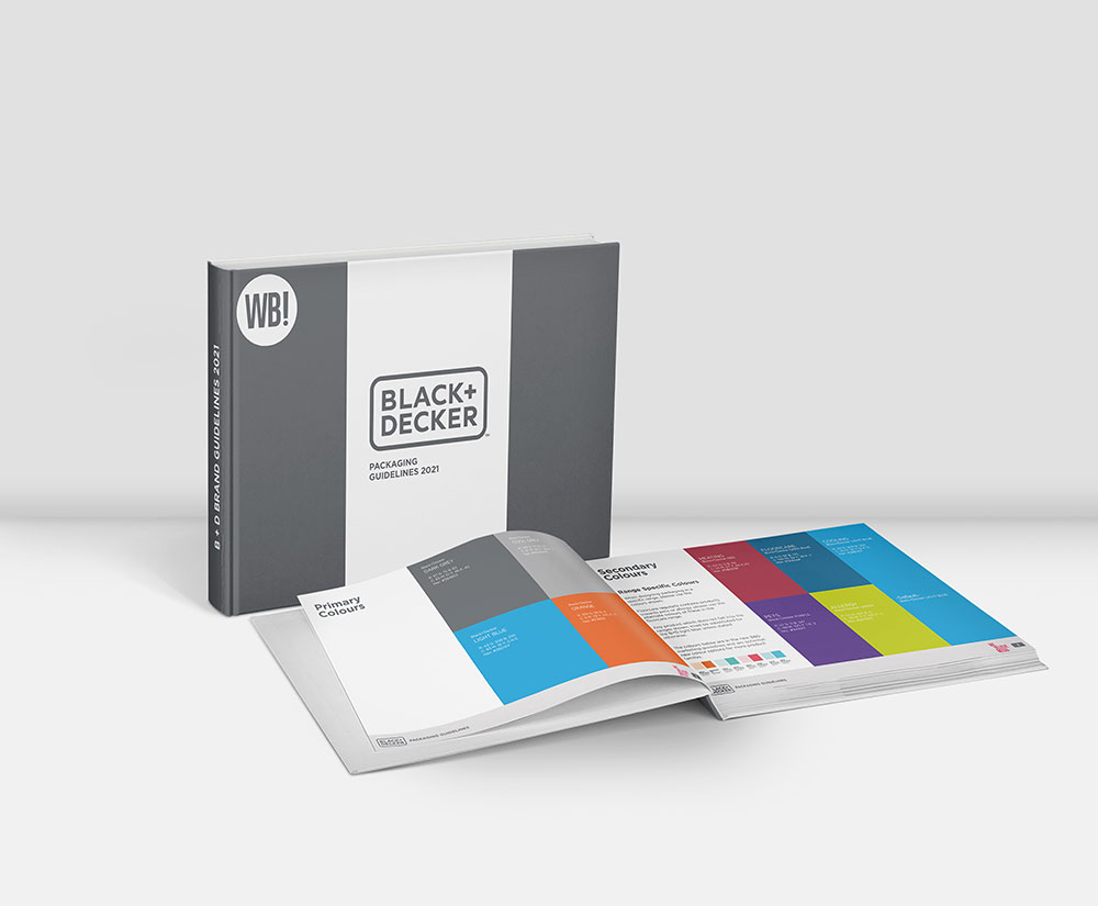
Black + Decker tasked us with creating the guidelines for their packaging artwork, showing variety in design for each product category.

Black + Decker tasked us with creating the guidelines for their packaging artwork, showing variety in design for each product category.
Black + Decker wanted to create visual consistency across their product range by developing brand guidelines. The guidelines included a variety of product ranges including, floorcare, cooling, heating, linen care and small kitchen appliances.
We shot the photography for the artwork in our studio sets. Our studio allows us to shoot a variety of scenes providing a range of shots in different environments while maintaining consistency for each product range. Furthermore, Black + Decker is a well-recognised brand, so it was important that we didn’t eliminate key visual features in the artwork.
Each product has unique features, and we highlighted these by placing each product on a box where consumers’ eyes would meet first. In addition, we streamlined the design to remove clutter and unscary information to help highlight the key features.
Black + Decker provided us with a brief to create packaging guidelines. The guidelines define a set of rules for image assets to ensure brand consistency across product lines. In addition, we included artwork that would go against brand guidelines in a ‘do’s and don’t’ style rule set. As a result, readers could visually see the new standards.
Black + Decker use the packaging guidelines for internal purposes, helping their teams understand the correct way to create assets for their product range.
Brand Guidelines in the form of:
A great company to work with- A true testament to their high industry credentials, WeBelieve creates best in class content always aiming to outperform any brief given. They work at speed and always happy to help on last minute projects, again with quick turn around which is always very helpful. I highly recommend this wonderful company.

Professional, knowledgeable and creative team who took our vague vision and transformed it into a fantastic promo video. The team really listened to our ideas and were enthusiastic and engaged throughout. We were given the opportunity to be involved every step of the way and they were never afraid to steer us in different directions where needed. Ultimately the final product was better than we had imagined and we couldn't be more delighted.
Very professional studio that have a hugely talented, creative and friendly team with expertise across a wide range of areas. Always go above and beyond to achieve the best results for their clients- highly recommend!
WeBelieve Media are a fantastic team, delivering a consistently professional and personal service. They go above and beyond to deliver results which surpass expectation and we love that both Jack and Adam aren't afraid to get personally involved during any stage of production. Highly recommend.
Great working with these guys, hope to do more work with them soon! Not only did they help us as a business but they have advised us on numerous occasions to give us help outside of our project we were working on!
Thanks for such a professional job We Believe Media! Truly amazed at how much goes into such short videos and attention to detail was superb! Very committed company and a great team to work with...
Awesome Pre-Roll, awesome guys to work with. Highly recommended!
Great job guys! Really showed our products in the best way possible!